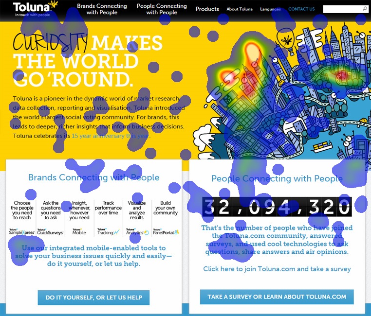
Colored Output
The below picture shows the heatmap colored output based on relative density of clicks received at different parts of the concept image. The blue and green colors indicates the low click density areas, yellow indicates the average click density areas while red and white indicates the high click density areas.
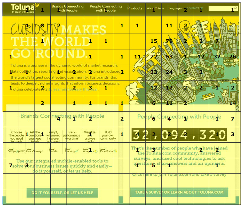
Grid Output
The below picture shows the heatmap grid output where we generate a grid overlay over the image and show the total number of clicks received by each box.